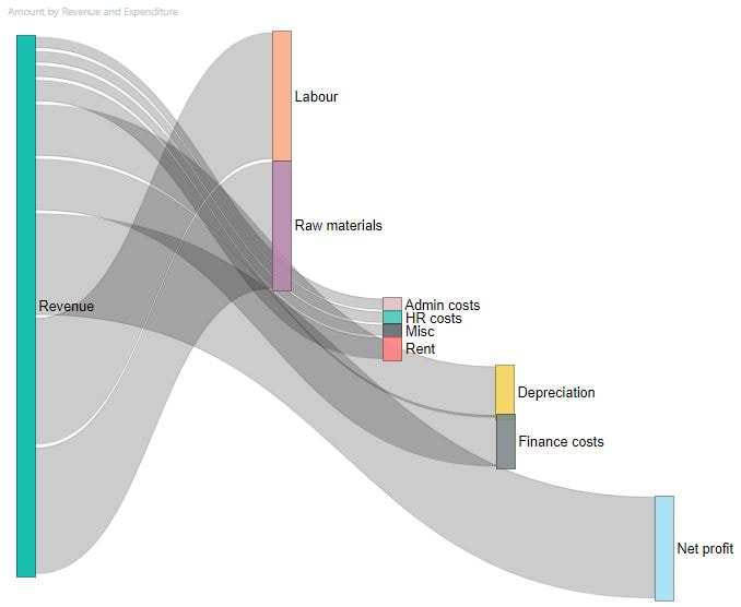
London SODA
  • Home
  • Articles
  • About
  • Home
  • Articles
  • About
Search by typing & pressing enter

YOUR CART

ARTICLES

12/2/2020 0 Comments

The Sankey Diagram


Introduction

​
Sankey Diagrams are used to visualise flows, processes and aggregated numbers. They are especially useful when breaking down a number into its component parts. The Sankey Diagram was first used by Matthew Sankey in 1898 to illustrate the flow of energy in a steam engine system. He wanted to visualise the energy efficiency of a steam combustion system by taking the input energy and sketching out where the energy went. ​
Picture
Bearing in mind Newton’s first law of thermodynamics, the conservation of energy, this chart shows the energy usage in its entirety and all of the outputs of the system are equal to the input(s) to the system.
Picture
Sankey Diagrams are primarily used in physics, particularly to visualise energy systems. However, with a bit of creative thinking, Sankey Diagrams can also be used to powerfully illustrate concepts in finance and operations.
​

A Sankey Diagram might be helpful if you are trying to show the composition or aggregation of a number or if you are trying to link two sets of numbers which add up to the same total but are segmented differently (e.g. breakdown of costs by country and breakdown of costs by type).
Example 1: P&L Diagram

Sankey Diagrams can illustrate the breakdown of a P&L, and how revenue is ‘used’ by costs in the business to arrive at net profit. Although a slightly abstract concept, this can really help to understand the orders of magnitude of costs at different levels of a business. This chart below separates COGs, overheads and depreciation / finance costs to understand costs at the gross profit, operating profit, EBITDA and net profit levels.
Picture
An alternative diagram could show cash inflows and outflows in a business, with cash surplus on the right hand side of the diagram. If there is a cash flow deficit, this could be included on the side of cash inflows, to represent cash useage from cash reserves rather than cash inflows during the period.

Example 2: Interview Process

Processes can be tricky to visualise in an intuitive way. Sankey Diagrams can show what’s gone where during a process, which is especially useful in multi-stage processes where the inputs can go down a variety of output paths.

One example of this is an interview process, where you have a homogenous input (applicants) and a variety of output paths that the applicant can go down, from falling at the first hurdle to finally accepting an offer. With many different possible outcomes, it can be difficult to visualise the process as a whole and understand what has happened to the applicants. Sankey Diagrams are a powerful way of showing a process in its entirety and giving a sense of scale.
Picture
Summary

Sankey Diagrams are a different breed of visualisation to the standard line, bar and pie charts, and they can be used to create very intuitive diagrams. The best use cases for Sankey Diagrams are numbers that require breaking down into their component parts or visualising processes with a numerical element. The key concept to remember is that the inputs and outputs of a Sankey Diagram must be equal, similarly to Newton's law of the conservation of energy. Although these diagrams are normally used in physics and energy flow diagrams, with a little bit of creative thinking they can be applied to a much broader range of topics.

Coder’s Corner

Creating Sankey Diagrams is a bit tricky, mainly because they are not standard visualisations that are readily available in common software. I think that the easiest way to create simple Sankey Diagrams is in Microsoft Power BI (the P&L diagram was created using this software), however this software has limited customisation options for Sankey Diagrams.

If you are desperate, you can create illustrative Sankey Diagrams just using the shapes in PowerPoint or Google Slides, however the scales and sizes will probably be incorrect and creating the chart might be time consuming.

If you are more confident in Python, matplotlib includes Sankey Diagrams that can be customised and joined together. The interview process chart was created using Google Colabs with the below code. I cheated slightly by removing the labels in Python and re-including them as a text box in Google Slides, because I wanted to have text in different colours which is tricky to do in Python.

​Code ->>
# Import library
import matplotlib.pyplot as plt
from matplotlib.sankey import Sankey


# Set up chart
fig = plt.figure(figsize = (40,40))
ax = fig.add_subplot(1, 1, 1, xticks=[], yticks=[], title="")
sankey = Sankey(ax=ax, scale=.05, offset=0.3, unit='')

# Stage 1 - Applicants -> Passed 1st Interview
sankey.add(flows=[50, -12, -38],
labels=['', '', ''],

# Rotate arrows for candidates leaving the process
orientations=[0, 0,-1],
trunklength = 3,
edgecolor = '#323232',
facecolor = '#323232')

# Stage 2 - Passed 1st Interview -> Outcomes
sankey.add(flows=[12, -1, -8, -3],
labels=['','', '', ''],
trunklength = 1,
pathlengths = [2,2,2,2],
orientations=[0, 1, 0, -1],

#Link Stage 1 & Stage 2
prior=0,
connect=(1, 0),
edgecolor = '#323232',
facecolor = '#ff96c9')
diagrams = sankey.finish()

# Set text size
for diagram in diagrams:
    for text in diagram.texts:
        text.set_fontsize(16);

0 Comments


Leave a Reply.

    Author

    London SODA

    View my profile on LinkedIn

    Archives

    February 2020
    October 2019
    August 2019
    June 2019
    April 2019

    Categories

    All

    RSS Feed

    Sign up for more LONDONSODA

Sign up