|
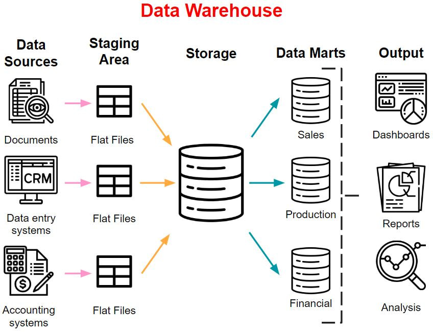
24/2/2020 5 Comments data warehousing
5 Comments
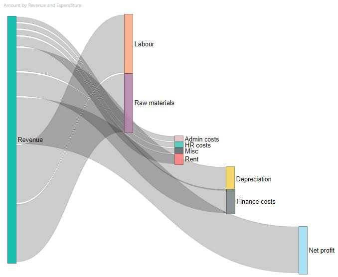
12/2/2020 2 Comments The Sankey Diagram
|
AuthorLondon SODA
Archives
February 2020
Categories |
|
24/2/2020 5 Comments data warehousing
5 Comments
12/2/2020 2 Comments The Sankey Diagram
|
AuthorLondon SODA
Archives
February 2020
Categories |


 RSS Feed