|
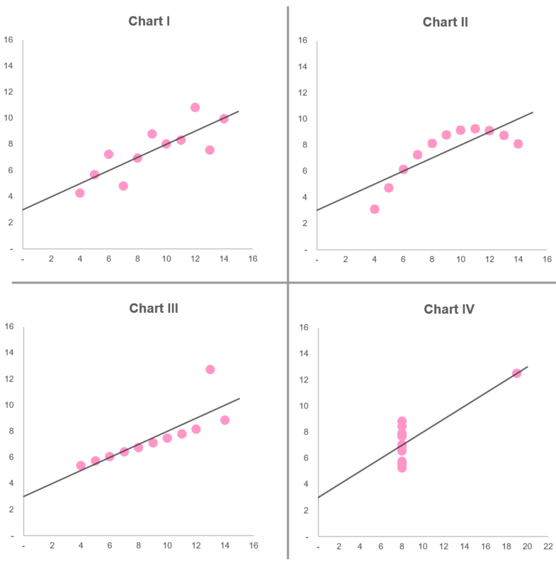
22/8/2019 2 Comments Anscombe's Quartet
2 Comments
|
AuthorLondon SODA
Archives
February 2020
Categories |
|
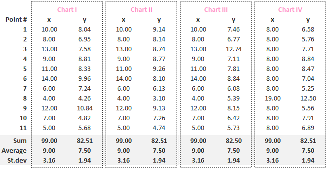
22/8/2019 2 Comments Anscombe's Quartet
2 Comments
|
AuthorLondon SODA
Archives
February 2020
Categories |

 RSS Feed