LATEST ARTICLES
BENFORD'S LAW
If you picked a random country and measured its population, there’s roughly a 30.1% chance the first digit of that number is a ‘1’ and a 17.6% chance that it is a ‘2’. The distribution of these first digits is known as Benford’s Law.
Benford’s Law, also known as the ‘leading digit rule’, appears everywhere in economics, human geography, nature and sports, but few people have ever heard of it. Why does this mathematical phenomenon exist? Where does it appear? So what? |
Dealing with outliers
At their best, outliers can help understand the scope and limitations of a model. At their worst, they create hidden fundamental flaws data sets that can skew models and muddy the waters of a model’s predictive power.
The method for dealing with outliers is often boiled down to ‘search and destroy’, which can lead to the loss of good data. But what if there was another way of dealing with outliers? What if you could use outliers to your advantage? What are outliers anyway? |
Anscombe's quartet
The definition of insanity, according to Albert Einstein, is to do the same thing over and over again and expect a different result.
But what about the other way round? What if you plotted four completely different data points on a chart but got exactly the same line of best fit each time? This is a short article about an illustration called Anscombe’s Quartet. It is an extreme example of how blind statistical analysis can trick you. It is also another reminder of the importance of visualising data in your EDA (Exploratory Data Analysis). |
Violin plots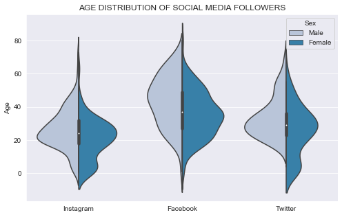
Everyone has their favourite chart that they like to talk about at parties, right?
Violin plots are a highly effective way to intuitively present insights from a data set and build up a picture of how a data set fits together. This article includes a case study about a retail company trying to understand its social media channel follower demographics. It explain what violin plots are and how you can use them to understand your data. It will also explain how to interpret box plots and violin plots before covering the party piece - the split violin plot. |
Sankey diagrams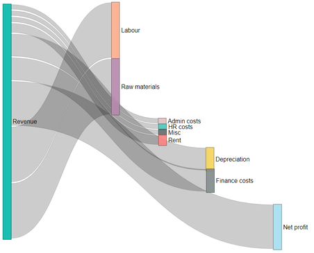
Sankey Diagrams are used to visualise flows, processes and aggregated numbers. They are especially useful when breaking down a number into its component parts.
Although conventionally used in physics and energy flow diagrams, with a bit of creativity they can be used to illustrate the breakdown of numbers and operational processes. |
Data warehousing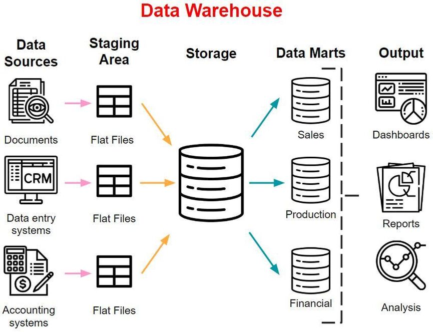
Unlike many misleading technology pseudonyms (looking at you ‘growth hacking’), data warehousing is a really good name:
- Warehouse: a building that collects materials, stores and packages them in a sensible order and sends the materials off to other parts of the business when required - Data warehouse: a computer system that collects, stores, processes and outputs data What is data warehousing and why is it important? |